
Americans Got Richer Over the Last Decade. Housing, Food and Healthcare Took Most of the Middle Class's Raise.
Know what's actually safe to spend in your own month — your real accounts, your real bills, including the ones that haven't hit yet.
See how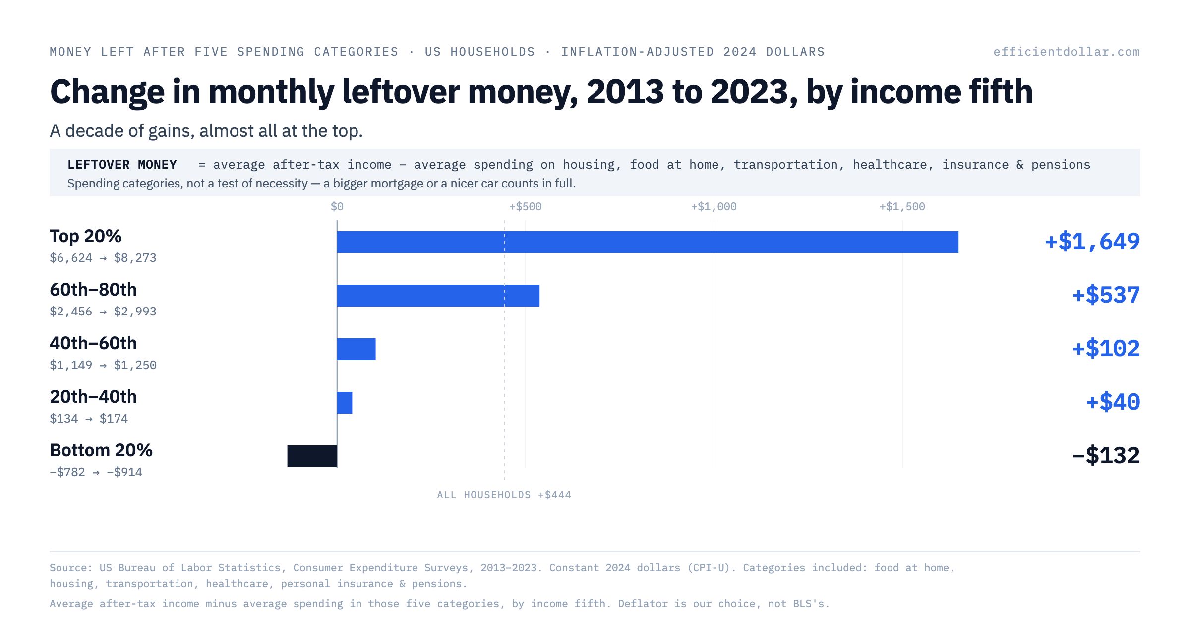
Key findings
- The average US household had $444 more per month left over in 2023 than in 2013, after inflation and after paying for housing, food at home, transportation, healthcare, and insurance and retirement contributions.
- That average hides almost everything. The middle fifth gained $102 a month over the same decade; the top fifth gained $1,649 a month.
- Those five categories absorbed 88% of the middle fifth's raise over the decade, 92% of the second fifth's, and 152% of the bottom fifth's — but only 46% of the top fifth's.
- That ladder is the sturdiest thing in the data: it runs in the same direction in all twelve tests — every window whose endpoints are at least eight years apart, on both published definitions of the basket.
- The bottom fifth's income grew faster than any other group's (+22.5% after inflation) and they still fell further behind, because those five categories already cost 169% of their take-home pay when the decade started.
- Those same categories now take 78.7% of everything American households spend — the highest in 41 years apart from 2020.
- "Essential" here labels a spending category, not a necessity. A bigger mortgage and a nicer car count in full.
Every number below comes from a dataset you can download and check — free, CC BY 4.0, with the data dictionary and the full working methodology.
Everyone knows Americans are getting squeezed.
It’s one of the few things people agree on anymore. Wages don’t keep up. Everything costs more. The middle class is disappearing.
So I went looking for the squeeze in the data. What I found is more uncomfortable than the story I expected, because the squeeze isn’t where everyone says it is.
Money left over after the big bills went up over the last decade. And the way it went up is more damning than a decline would have been.
The numbers are from the Bureau of Labor Statistics’ Consumer Expenditure Survey. It’s the only source that measures what the same households earn and what they spend, which matters more than it sounds like it does — subtract one survey’s spending from another survey’s income and you get a number about nobody who exists.
Start with the number that doesn’t fit the mood
Take the average American household’s income after taxes. Subtract what it spent in five categories: food at home, housing, transportation, healthcare, and personal insurance and pensions, which is mostly Social Security and retirement contributions.
That’s the St. Louis Fed’s list, not mine. Whoever picks the categories picks the answer, so I wanted the picking done by an institution with nothing riding on the result.
Here’s what’s left, in constant 2024 dollars:
| 2013 | 2023 | Change | |
|---|---|---|---|
| Leftover, per year | $22,978 | $28,302 | +$5,324 |
| Leftover, per month | $1,915 | $2,358 | +$444 |
A 23% increase in real terms. Not nothing.
If you’d told me in advance that a decade of BLS data showed Americans with an extra $444 a month after the big bills, I would have guessed the story wrote itself in the optimistic direction.
It doesn’t. That $444 is an average, and the average is doing an enormous amount of work.
One thing to carry through the rest of this, because it’s the largest limitation in the whole piece: “essential” is the name of a spending category here, not a judgment about necessity. Every dollar spent inside those five buckets counts, however optional it actually was. A bigger mortgage counts in full. So does a nicer car and a better grocery store.
I come back to it at the end with numbers.
| Income fifth | 2013 | 2023 | Change per month |
|---|---|---|---|
| Lowest 20% | −$782 | −$914 | −$132 |
| Second 20% | $134 | $174 | +$40 |
| Third 20% | $1,149 | $1,250 | +$102 |
| Fourth 20% | $2,456 | $2,993 | +$537 |
| Highest 20% | $6,624 | $8,273 | +$1,649 |
The middle fifth of American households got an extra $102 a month out of a decade. A little over three dollars a day.
The top fifth got sixteen times as much.
Which fifth is yours?
This table is a survey average for a whole income group. Get the number for your own accounts instead — what's actually left after your real bills, including the ones that haven't hit yet.
Get early accessThe percentages and the dollars tell opposite stories
This is the part that makes the whole thing hard to write about honestly.
Look at percentage growth and the decade reads as broadly shared, even slightly progressive. The second fifth’s leftover money grew 30.0% — faster than the top fifth’s 24.9%. You could write a perfectly true headline about how the gains reached everyone.
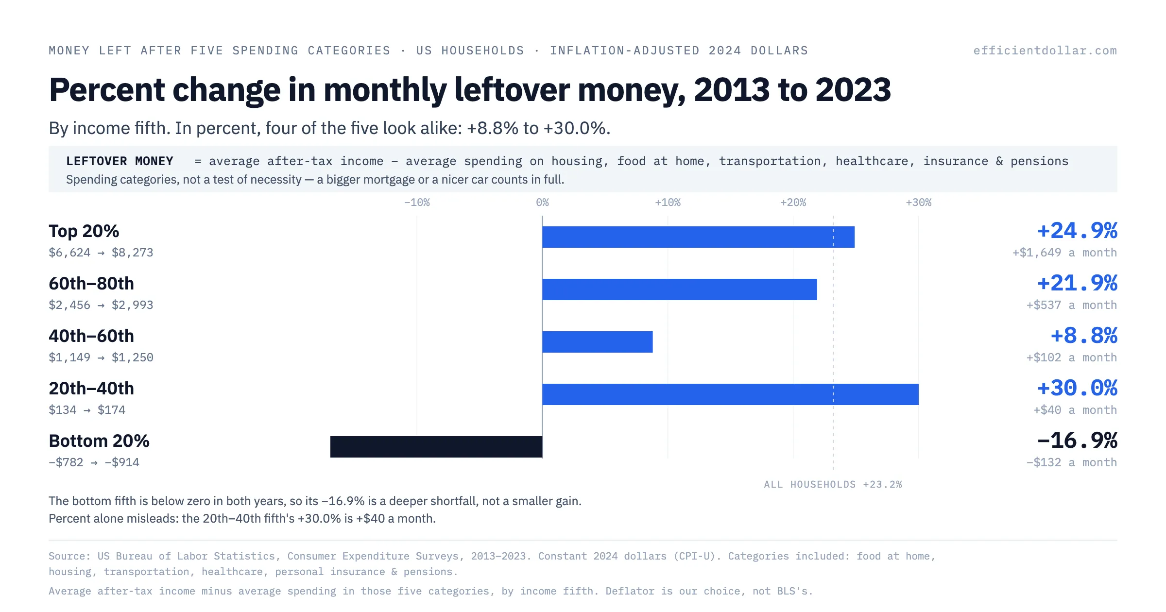
That headline would also be useless. Thirty percent of $1,602 is $481 a year.
You cannot pay a car repair with a percentage.
This is the oldest trick in distributional statistics and it usually isn’t anyone’s fault. It’s just what happens when you compute growth rates off wildly different bases. But somebody has to decide which number leads, and the dollars win.
Dollars are what you spend.
The better question is what happened to the raise
Every income group’s real after-tax income rose over the decade. Every group’s spending on those five categories rose too.
The number worth looking at is what share of the raise the categories ate:
| Income fifth | Real income gain, 2013–2023 | Five-category gain | Share of the raise absorbed |
|---|---|---|---|
| Lowest 20% | +$3,059 | +$4,642 | 152% |
| Second 20% | +$5,780 | +$5,299 | 92% |
| Third 20% | +$9,872 | +$8,653 | 88% |
| Fourth 20% | +$16,961 | +$10,519 | 62% |
| Highest 20% | +$36,769 | +$16,977 | 46% |
| All households | +$14,580 | +$9,255 | 63% |
That ladder is about as clean as anything I’ve found in survey data. The less you earn, the more of your raise the five categories took.
The middle fifth earned about $9,900 more in 2023 than in 2013, after inflation and after tax. Those five categories took about $8,700 of it.
Eighty-eight cents of every extra dollar. Which is why a decade of real income growth can be completely real and still feel like nothing happened.
The top fifth handed over 46 cents and kept the rest. Same economy, same decade.
I tried hard to break this one and couldn’t
Any finding built on a start year and an end year is a finding about two years. I’ve watched too many of these evaporate when somebody slides the window, so before writing it down I checked every window whose endpoints are at least eight years apart — six of them — on both of the basket definitions BLS publishes.
Twelve tests. The ladder came out in the same order every time.
Bottom fifth highest, top fifth lowest, strictly descending in between, twelve for twelve. The levels move around a lot — across those twelve tests the bottom fifth’s figure lands anywhere from 106% to 209%, and the top fifth’s from 18% to 46% — but the ordering never breaks.
That’s rarer than it sounds. It’s why this is the finding I’d put my name on rather than any of the shinier ones in here.
And here’s what it actually means, which is less flattering to me
There’s a reason that ladder is so orderly, and honesty requires saying it: it is almost entirely predicted by where each group started. Line up each fifth’s absorption rate against the share of income those categories were already taking in 2013 and the two track each other at a correlation of 0.98.
Which makes sense. If housing and food and healthcare already eat 169% of what you bring home, a raise doesn’t have many places to go.
I spent a while treating that as a problem, as though discovering the mechanism behind a finding disqualifies it. It doesn’t. It just means the honest sentence is structural rather than dramatic: the further behind you start, the less of any raise you get to keep — and that relationship is stable enough to survive every way I know how to slice this data.
Not a decade-specific misfortune. Closer to a rule.
I’ll add the one thing I checked that didn’t hold up, since it was nearly the headline. Divide each group’s cost growth by its income growth and the middle fifth is the only one above 1.0 over 2013–2023, the only fifth whose basic costs outran its paycheck. Great line. Also an accident of the start year: move it to 2014 and the second fifth takes its place, move it to 2015 and three fifths qualify, end in 2021 and none do.
So it isn’t in this post as a finding. It’s here as a warning about how easily one gets manufactured.
The bottom fifth’s income grew fastest — and they still fell further behind
This is the finding I was least prepared for, and the one I’d most want an economist to check.
The lowest fifth’s after-tax income grew 22.5% in real terms over the decade. That’s the fastest growth of any income group — faster than the top fifth’s 20.4%, faster than the middle’s 16.8%.
They still ended up worse off in dollars: −$782 a month in 2013, −$914 a month in 2023.
The arithmetic isn’t complicated once you see it. This group’s spending in those five categories comes to 166% of their take-home pay. When your costs start the decade 69% above your income, your income has to grow dramatically faster than your costs just to keep the gap from widening.
Theirs grew faster than everyone’s. It wasn’t close to enough.
There’s one thing here that cuts the other way, and I’d be misrepresenting the data if I skipped it: as a share of their income, this group’s essentials actually eased slightly, from 169.0% in 2013 to 165.8% in 2023. Worse in dollars, marginally better in ratio. Both are true. The worst year in the series was 2019, at 182.9%.
And before anyone builds a narrative on the shape of that line — this series bounces hard. The bottom fifth’s leftover money ran −$9,379 in 2013, −$12,442 in 2019, −$9,735 in 2020, −$10,962 in 2023.
Ten-year endpoints are a fair summary. They are not a trend line.
Here’s the whole decade, so you can see it rather than take my word for it:
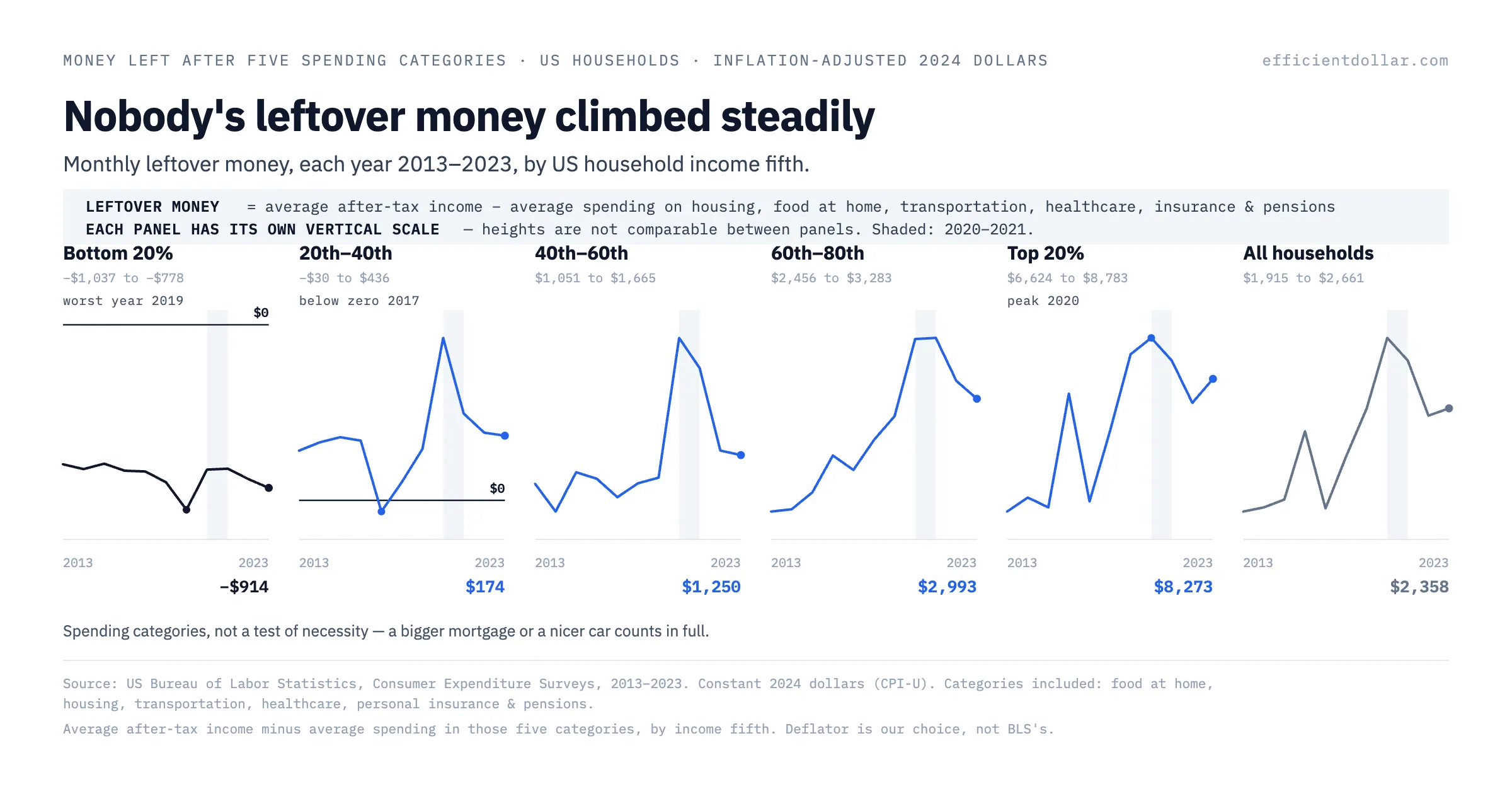
Nobody’s line climbs steadily. The top fifth’s best year was 2020, not 2023. The second fifth dipped below zero in 2017.
If I’d picked 2019 and 2020 as endpoints instead of 2013 and 2023, I could have written a story about the bottom fifth improving by $2,700. It would have been true, and worthless.
Now the series that points the other way
Everything above says leftover money grew. Here’s a second series from the same survey that says the opposite, and I don’t think either one is wrong.
Essential spending as a share of everything American households spend has been climbing for four decades:
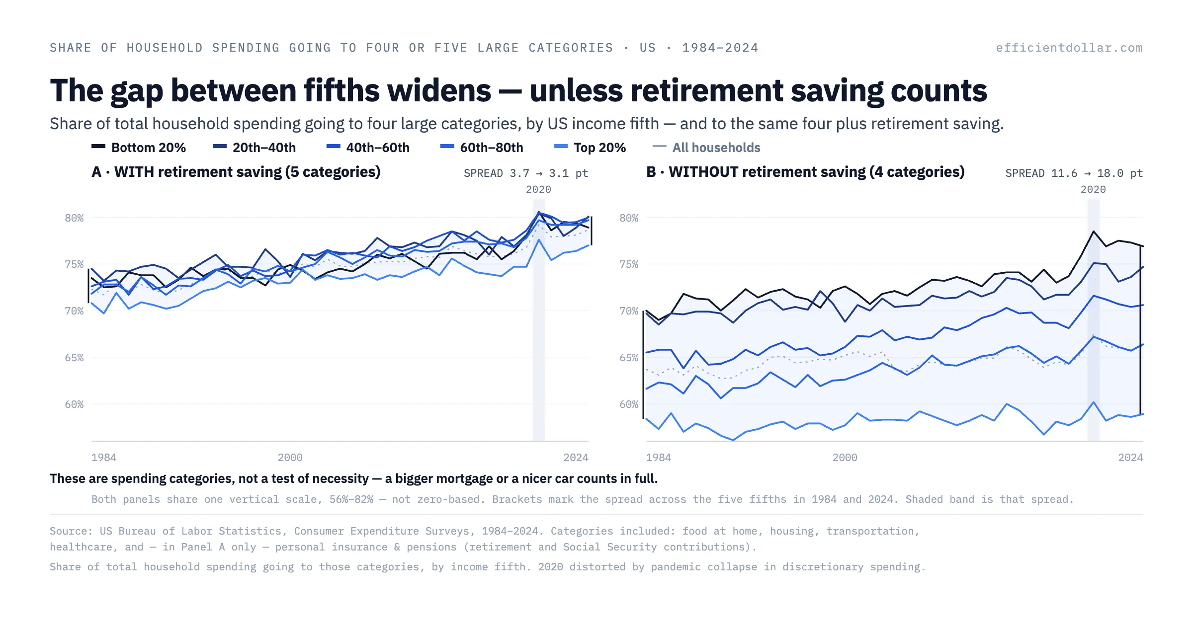
In 1984, essentials took 72.3% of the average household’s spending. In 2024, 78.7%. That’s the highest reading in the 41-year series with one exception — 2020, when discretionary spending collapsed and the share spiked to 79.2%.
Take the pandemic out and 2024 is the record.
Then I tried to answer the obvious follow-up — who got squeezed — and ran into the most interesting thing in this dataset.
The answer depends entirely on one definitional choice
Our basket includes personal insurance and pensions, which is mostly Social Security contributions and retirement deposits. That’s the St. Louis Fed’s list and I kept it. But you could reasonably argue retirement saving isn’t an expense at all. It’s money you’re keeping.
BLS publishes the numbers both ways and privileges neither.
Count retirement saving as essential, and the five income fifths converge:
| Income fifth | 1984 | 2024 | Change |
|---|---|---|---|
| Lowest 20% | 73.5% | 78.9% | +5.4pp |
| Second 20% | 74.5% | 80.1% | +5.6pp |
| Third 20% | 72.6% | 80.0% | +7.3pp |
| Fourth 20% | 71.8% | 79.7% | +7.9pp |
| Highest 20% | 70.8% | 77.0% | +6.3pp |
Read that table and the story is that the squeeze hit the middle and upper-middle hardest, and that everyone now lives in the same narrow band — the spread across the fifths shrank from 3.7 points to 3.1. How much of your budget these five categories claim no longer depends much on what you earn.
Now take retirement saving out:
| Income fifth | 1984 | 2024 | Change |
|---|---|---|---|
| Lowest 20% | 70.0% | 76.9% | +7.0pp |
| Second 20% | 69.7% | 74.7% | +5.0pp |
| Third 20% | 65.5% | 70.6% | +5.2pp |
| Fourth 20% | 61.6% | 66.4% | +4.7pp |
| Highest 20% | 58.4% | 58.9% | +0.5pp |
Everything flips. The squeeze now lands hardest on the poorest, the top fifth is essentially untouched across four decades, and the fifths don’t converge at all — the spread widens, from 11.6 points to 18.0.
Same survey, same 41 years, same households. One spending line moved and the conclusion inverted.
I went back and forth on which to lead with and decided not to pick one, because picking one is the whole problem. What’s actually true is narrower and more useful: essentials take a growing share of what everyone spends, and whether that squeeze fell evenly across the income distribution is not something this data can settle.
Count retirement saving as an expense and it fell evenly. Don’t, and it fell on the bottom.
One more thing before you read too much into any of this
“Essential” here means a spending category, not a necessity. Every dollar spent inside those categories counts, no matter how discretionary it actually was. In 2023 the top fifth spent 2.5 times what the bottom fifth spent on groceries, 3.1 times on housing, and 5.1 times on transportation.
Nobody eats two and a half times the calories.
That’s the difference between Whole Foods and the discount aisle, and it lands in “essentials” in full. So does the mortgage on a house bigger than anyone needs, and the car payment on something nicer than a commute requires.
Which means a high essentials share doesn’t prove a household is under pressure. For the bottom fifth, spending 166% of its take-home pay, it clearly does. For the top fifth it partly reflects buying expensive versions of necessary things, which is a choice and not a squeeze. Any chart of essentials-as-a-share has this built into it, including mine.
So: leftover dollars up, five-category share up. Both from the same survey, both correct.
Incomes outran spending, which lifted the dollar residual, while the composition of spending shifted toward the categories that are hardest to cut. The tension isn’t a flaw in the data. The tension is the finding — and most published treatments of this question pick one series and tell half the story.
Three things these numbers do not include
I’d rather hand you the holes than have you find them.
Employer-paid health insurance is invisible here. It appears in neither the income side nor the spending side of this survey. The employer’s share of family coverage was $20,143 in 2025 according to KFF — roughly 3.25 times the entire healthcare line in this dataset. This exact unit mismatch accounted for more than half of the Cost-of-Thriving Index’s headline finding a few years ago, and it’s what discredited it. If employer premiums grew faster than wages over this decade, and they did, the income figures here understate what households actually received.
Mortgage principal isn’t counted as spending. The survey treats it as asset accumulation, not consumption. So “total expenditures” is not money out the door, and a homeowner’s real cash outflow is higher than it looks.
The reference household changed. The average age of the reference person rose from 46.7 to 52.2 across the published span, and BLS’s summary tables show household size drifting down from about 2.6 to 2.4 people. Older, smaller households need less. Some part of any rising residual is demography rather than affordability, and I can’t tell you how much.
The trap I nearly fell into
There’s a tempting story in this data that I want to defuse, because I started writing it before I checked.
Middle-fifth non-essential spending fell from 27.4% to 20.0% of the budget between 1984 and 2024. That looks like people cutting back on everything fun because the big categories ate the budget.
Then you decompose it. Of the total real decline across the non-essential categories that actually fell:
| Category | Real change | Share of the decline |
|---|---|---|
| Apparel | −$2,192 | 61.3% |
| Food away from home | −$412 | 11.5% |
| Alcohol | −$314 | 8.8% |
| Tobacco | −$297 | 8.3% |
| Reading | −$280 | 7.8% |
| Miscellaneous | −$83 | 2.3% |
Apparel alone is nearly two-thirds of it. Clothing got dramatically cheaper over forty years. That’s a globalized-supply-chain story, not an affordability story. Collapsing smoking rates and the death of print add another 16 cents on the dollar between them, and eating out and alcohol most of the remainder.
Undecomposed, that 27.4%-to-20.0% line looks like a squeeze. Decomposed, it’s mostly Old Navy.
Anyone who reports the first number without the second is publishing the wrong finding.
People have stood next to this question before
The honest claim here is defensibility, not originality.
The St. Louis Fed published a one-year version of exactly this calculation in August 2025, and reproducing their published figures is how I know the construction is sound: their after-tax income, their leftover figure and their lowest-quintile figure all land within rounding of what I derived independently from the raw BLS files. Three for three. What’s added here is the decade and the breakdown by income fifth.
The Hamilton Project charted these spending shares from 1984 to 2014 and stopped one subtraction short of the residual.
LISEP, the Ludwig Institute for Shared Economic Prosperity, publishes the closest thing that exists — Leftover Earnings After Basic Living Expenses, annual dollars back to 2001. It differs from this in three ways that matter. Theirs is pre-tax: no taxes subtracted, no government transfers added. Theirs is assumed rather than measured — every adult presumed to be a full-time worker earning the median wage, priced against a normative basket of what a family ought to need. And theirs is cut by family structure where this is cut by income.
LISEP is measuring a standard. This is measuring a population.
So what do you do with this
I don’t think the takeaway is that things got worse. The data don’t say that, and saying it anyway is how you end up with a finding that falls apart when somebody checks.
The takeaway is that the average is lying to you, and it’s lying in a specific, structural way.
Real income growth was genuinely widespread over this decade. So was the growth in what housing, food, transportation, healthcare and insurance cost. For most households those two things very nearly cancelled, and the residual — the part you actually get to decide about — barely moved.
If you’re in the middle fifth, a decade of real economic growth handed you three dollars a day of additional freedom. That is not a story about anyone’s spending discipline. It’s a story about what a raise is worth after the big categories take their cut, and how much that depends on where you started.
Which is worth knowing before you assume next year’s raise will change anything.
Methodology
Primary source: US Bureau of Labor Statistics, Consumer Expenditure Surveys, retrieved from the LABSTAT bulk time series. Published annual means by income quintile — not microdata. All figures are US consumer-unit averages.
The construction. Leftover money = income after taxes − essential spending, where both terms are published annual means for the same quintile of consumer units in the same year. Because both come from the same survey and the same households, the subtraction is meaningful — subtracting one survey’s spending from another survey’s income produces a number about no household that exists.
Essentials are five categories: food at home, housing, transportation, healthcare, and personal insurance & pensions. This list follows the St. Louis Fed’s “That Extra Money: A Primer on Discretionary Income” (August 2025), so that the normative call about what counts as essential belongs to an institution with no stake in the conclusion. The Fed frames essentials in plain language — “rent or mortgage, groceries, utilities like electricity and water, insurance, car payments and taxes” — and the five survey categories above are the basket that reproduces its published figures. Taxes are handled by starting from after-tax income rather than by subtracting a spending line. Note that this survey’s housing line is broader than a housing payment: it includes utilities, household operations (which contains childcare), housekeeping supplies and furnishings.
The sensitivity band, and where it bites. The single largest definitional lever is personal insurance & pensions, which is mostly Social Security contributions and retirement deposits and is arguably saving rather than consumption. Removing it gives a “narrow” basket of four categories. BLS publishes both; neither is privileged.
Every dollar finding in this post survives that swap. Leftover money still rises for four of five fifths and still falls for the lowest (−$123/month narrow against −$132 broad), and the share of the decade’s raise absorbed by essentials stays monotonic across the distribution: 148% / 84% / 73% / 42% / 28% on the narrow basket against 152% / 92% / 88% / 62% / 46% on the broad. In 2023, essentials as a share of after-tax income run 165.8% / 95.0% / 78.1% / 66.6% / 54.3% broad and 161.4% / 88.6% / 69.2% / 55.3% / 41.7% narrow.
Endpoint robustness. A two-year comparison is a claim about two years, so the absorption ladder was re-run over every window whose endpoints are at least eight years apart — 2013–2021, 2013–2022, 2013–2023, 2014–2022, 2014–2023 and 2015–2023 — on both baskets. It is strictly decreasing from the lowest fifth to the highest in all twelve, although the levels move a great deal (across those twelve tests the lowest fifth’s absorption ranges from 106.2% to 208.9%, and the highest fifth’s from 18.3% to 46.2%). Across the five fifths, absorption correlates with each group’s 2013 share of income at 0.98, so the ladder largely restates starting position — stated in the body, because it is the mechanism rather than a defect. One statistic that does not survive this test, and is therefore deliberately absent from the post’s findings: the ratio of each group’s cost growth to its income growth, which puts the middle fifth alone above 1.0 over 2013–2023 but hands that distinction to the second fifth on 2014–2023, to three fifths on 2015–2023, and to none on 2013–2021.
The share-of-spending series does not survive it, and that is disclosed in the body above rather than buried here: on the broad basket the five fifths converge (spread 3.7pp → 3.1pp, largest rise in the fourth fifth), and on the narrow basket they diverge (spread 11.6pp → 18.0pp, largest rise in the lowest fifth, top fifth +0.5pp). Any published claim about who the essentials squeeze fell on must state which basket it rests on.
“Essential” is a category, not a necessity. Every dollar spent inside those five categories counts, however discretionary it was in practice. In 2023 the highest fifth spent 2.5× the lowest on food at home, 3.1× on housing and 5.1× on transportation. A high essentials share is therefore not by itself evidence of financial pressure, and no figure in this post should be read as though it were.
Why the dollar series starts in 2013, and why there is no 40-year version. Two reasons, both structural rather than convenient. First, from 2013 the survey’s tax figures are modeled rather than reported — real personal taxes step from $3,041 to $10,008 across 2012–2013, which is a 3.3× methodology artifact, not a tax increase. Second, and more seriously, this survey’s coverage of national consumption fell from roughly 0.795 of personal consumption expenditures in 1984 to 0.536 in 2024. Under-captured spending mechanically manufactures a rising leftover residual. A 40-year real-dollar chart of this series would be one of the most misleading things I could publish, so it isn’t here. The 41-year share series is a ratio, which cancels part of that drift — but not all of it, and it is presented as a share for exactly that reason.
Two other breaks worth knowing. Before 2004, income statistics came from complete income reporters only while spending statistics came from all consumer units — different households in the numerator and denominator, so no income-based figure may be compared across 2003/2004. And the health insurance line carries its own 2013–2014 question redesign, moving $2,229 → $2,868 (+28.7% nominal), so healthcare levels are not comparable across that boundary.
Inflation adjustment. Constant 2024 dollars using CPI-U annual averages (CUUR0000SA0). This deflator is our choice, not BLS’s — BLS publishes this survey in nominal dollars and has no house method for deflating it. Any real-dollar figure above should be read as ours.
Validation. The construction reproduces all three figures the St. Louis Fed published for 2023. These three figures are nominal 2023 dollars, not the constant 2024 dollars used everywhere else in this post, because that is the basis the Fed published on — which is why leftover here reads $27,491 against the $28,302 in the tables above: mean after-tax income (derived $87,869 vs published ~$88,000), leftover for all households ($27,491 vs ~$27,000), and leftover for the lowest fifth (−$10,648 vs ~−$11,000). Separately, enumerating all 32,767 possible subsets of the survey’s 15 top-level spending lines, 200 reproduce both published figures within $1,000 and 42 within $500 — so 99.4% of candidate baskets fail, and this one is the only five-component basket that passes at any tolerance. The core of the basket is robustly identified; the edge is not: every passer with seven or fewer components contains these five as its core.
Get the data. Every number in this post comes from a dataset you can download and check: Money left after essentials, free under CC BY 4.0, in CSV and Parquet, with a data dictionary and the full working methodology — including the two findings I withdrew along the way and why each was wrong. Both baskets are in every row, so you can reproduce the narrow-basket version of any figure above rather than taking my word for which one holds.
FAQ
How much money does the average American have left after essentials? ▶
About $2,358 a month in 2023, or $28,302 a year, in constant 2024 dollars — average after-tax income minus average spending on food at home, housing, transportation, healthcare, and personal insurance and pensions. That figure is an average across all US households and hides an enormous spread: the middle fifth had about $1,250 a month left, while the lowest fifth was $914 a month short.
Is money left over after essentials rising or falling? ▶
Rising, in inflation-adjusted dollars, for four of the five income fifths between 2013 and 2023 — but very unevenly. The average household gained $444 a month, the middle fifth gained $102 a month, and the lowest fifth lost $132 a month. Over the same period, essentials rose to 78.7% of everything US households spend, the highest share in 41 years apart from 2020.
Why does it feel like there's less money left over when the data says there's more? ▶
Because essentials absorbed most of the income growth. The middle fifth's real after-tax income rose about $9,900 over the decade and its essential spending rose about $8,700 — so 88 cents of every extra dollar went straight back out to those five categories. For the second fifth it was 92 cents, and for the lowest fifth essentials rose more than income did. Real growth can be entirely real and still leave almost nothing you get to decide about.
Which income group got squeezed the most? ▶
Measured in dollars left over, the lowest fifth is the only group that went backwards, losing $132 a month between 2013 and 2023. Measured as essentials' share of total spending from 1984 to 2024, the answer flips depending on one definitional choice: counting retirement and Social Security contributions as essential, the biggest increases were the fourth fifth (+7.9 points) and third fifth (+7.3), against the lowest fifth's +5.4. Excluding retirement saving, the lowest fifth rises most (+7.0) and the highest fifth barely moves (+0.5). Both versions are published by BLS and neither is privileged, so this particular question does not have a single defensible answer.
How can the lowest fifth spend 166% of its income on essentials? ▶
The gap is filled by borrowing, drawing down savings, help from family, and in-kind support that this survey's income measure does not capture. It is a long-standing and well-documented feature of consumer expenditure data rather than an error: households at the bottom of the income distribution consistently report spending more than their measured income, partly because the group includes people with temporarily low income such as students, the recently unemployed, and retirees living on assets.
What counts as an essential expense in this analysis? ▶
Five categories: food at home, housing, transportation, healthcare, and personal insurance and pensions. That list comes from the St. Louis Fed rather than from us, deliberately — the definition swings the answer by more than double, so whoever picks the categories picks the result. Removing personal insurance and pensions, which is mostly Social Security and retirement contributions, changes every level but no direction.
Does "essential" mean the spending was actually necessary? ▶
No. "Essential" names a spending category, not a test of necessity, and every dollar spent inside those five categories counts no matter how discretionary it was. In 2023 the highest-income fifth spent 2.5 times what the lowest fifth spent on food at home, 3.1 times as much on housing and 5.1 times as much on transportation — nobody eats two and a half times the calories. A larger mortgage, a nicer car and a more expensive grocery store all land in "essentials" in full, so a high essentials share is not by itself evidence that a household is under financial pressure.
Related Tools
- Spending Breakdown — see how the typical American household at your income spends every dollar.
- Spending Percentile Calculator — the answer to “but the average isn’t me”: where your grocery, rent or transportation spending lands among households of your size at your income — groceries and transportation from the same BLS survey this post draws on, rent from the Census Bureau so it can go local.
- Income Percentile Calculator — find where your household income ranks nationally and in your state, county, or ZIP.
- Budget Calculator — build a budget around what’s actually left after the big recurring categories.
Related Articles
- How Americans Spend Money by Income — the single-year, pre-tax, by-decile companion to this post: where every dollar goes, rather than what’s left after the essentials.
- Americans With Credit Card Debt Aren’t Reckless. They’re Committed. — what happens to households whose cash flow is fully committed before the year starts.
- Where Every Dollar of Your Paycheck Goes — the same question at the level of a single paycheck.
- How to Stop Overspending — the structural fix when the problem isn’t discipline.
Source: US Bureau of Labor Statistics, Consumer Expenditure Surveys, published annual means by income quintile via the LABSTAT bulk time series. Dollar series 2013–2023 (after-tax income is discontinued after 2023); share series 1984–2024. Constant 2024 dollars via CPI-U annual averages (CUUR0000SA0) — a deflator we chose, not one BLS publishes. Essentials = food at home, housing, transportation, healthcare, personal insurance & pensions, following the St. Louis Fed’s primer on discretionary income (August 2025). Employer-paid health insurance appears in neither income nor spending in this survey; mortgage principal is excluded from spending.
Know what's left in your own month
Everything above is what the Consumer Expenditure Survey says about American households in general. Efficient Dollar does the same subtraction on yours — every account you connect and every bill, tracked automatically, with one number each day telling you what's actually safe to spend.
Get early access